25/02/2020: Visit at London Design Museum
DESIGN MUSEUM
Exhibitions:
- PriestmanGoode presents Get Onboard: Reduce. Reuse. Rethink
- Material Innovation: Sustainable Textiles (from May 3rd)

PriestmanGoode presents Get Onboard: Reduce. Reuse. Rethink
What to expect?
"This display presents a project by London-based design firm PriestmanGoode that aims to raise awareness of how much waste is generated through air travel. For instance, every passenger on a long haul flight generates more than a kilogram of material waste. The total impact on the environment is enormous."
What aspects of information can I use for my idea development?
This exhibition highlights that we have to rethink our choices, both as designers and consumers. It also shows the responsibility that one has within the creative industry. This exhibition might be very helpful to inform material choices and concepts of reducing waste.
Did the visit match my expectations and how did it inform the decision of my new project?
I have not expected such range of very innovative materials. It really informed my primary research during my Commune project. They displayed materials as algae, coffee grounds, rice husk, bamboo, wheat bran, wafer, coconut wood, chitin, bamboo, bargasse and elephant grass. Therefore, I looked a bit more at algae, chitin and plant based materials during my Commune project. This informed my decision to look at alternatives for current unsustainabke materials. It is really about RETHINKING.
26/02/2020: Alternatives
Anthony Burrill
Oil & Water Do Not Mix

How does this project informs the development of my ideas?
This is a perfect example of making use of the environment and your surroundings. Anthony Burrill made this screen print by using crude oil that he collected at the Gulf of Mexico during the catastrophe in 2010.
It also shows the possibilities of print. This print is made of substances that have been very destructive for environment. This project which raises money for organisations that support the clean-up of the golf of Mexico gives these damaging substances a second chance. He uses the problem causing substance to solve this problem.
I want to make use of my surroundings as well by using actual found materials and objects. Further, I want to create a system that offers sustainable alternatives for harmful industrial processes such as the use of plastic or print with toxic and unrecyclable ink. This system is based on circular economy.
ByFusion

The image above shows a block of compressed plastic waste which can be used as a building material. The start-up team ByFusion still thinks about different applications for this material because they do not want to dictate a specific usage.
How does this project influence my development?
This project shows the different opportunities of working with various materials. The approach of the team underlines this open and broad aim. Sustainability is also achieved by thinking of multi-purpose designs so that this is a perfect example of that. One material can be used in many different ways.
Creativity is not about creating something out of nowhere. It is about using the available resources and rethinking existing concepts in order to create something new.
What approach does this project follow?
There are different approaches in order to fight climate crisis. On the one hand, you can think about alternative materials and processes. On the other hand, you can use the waste that has been already produces to rethink its purpose and use. ByFusion aims to reuse already produced waste. In my opinion, either of these approaches is important. We definitely need to start using different materials to reduce waste. However, it is a fact that there is a huge amount of waste that is damaging nature right now.
26/02/2020: How paper is made
Science ABC. (2020). How is Paper Made?. [online] Available at: https://www.scienceabc.com/eyeopeners/how-is-paper-made.html [Accessed 26 Feb. 2020].
- crush wood into small pieces
- cooked in a solution of acid to separate the desirable plant fibers from the undesirable lignin
- pulp (now described as wood-free) is cleaned and bleached (oxygens or peroxide) with water
- pulp is passed through blades to flatten and fibrillate the fibers
- add calcium carbonate for more density and opaqueness, starch or dyes
- eliminate water
- increase pressure and temperature
- dry sheet
How can I resemble that process?
The technologies do not really differ from the possibilities that I have at home. The only issue is that machines probably work more precise and accurate than me. Nevertheless, I can hand-beat or blend the plants to isolate the fibres.
In addition to that, I want to experiment with natural substances that meme the acid and bleach such as vinegar or citric acid. To flatten the fibres I will try different devices such as brushes. Furthermore, I want to use natural dye from fruits and vegetables.
26/02/2020: Waste
What is WASTE?
- "unwanted or unusable material, substances, or by products"
- "an act or instance of using or expending something carelessly, extravagantly, or to no purpose"
- "a large area of barren, typically uninhabited land"
- "damage to an estate caused by an act or by neglect, especially by a life tenant"
When we talk about the noun waste we often mean trash which is associated with the first definition. However, waste as trash is a representation of careless use of a certain material. If we think of plastic water bottles which are often only used once, the inefficient and wasteful and extravagant - unsustainable - use is shown clearly.
03/03/2020: My audience
https://www.recyclingtoday.com/article/young-adults-harris-poll-recycling-no/
TARGET AUDIENCE
This survey was conducted online within the United States by Harris Poll on behalf of ISRI from Nov. 3-5, 2014 among 2,013 adults ages 18 and older.
- A majority of Americans (94 percent) say they recycle, but those ages 35 and older (48 percent) are significantly more likely than those ages 18-34 (33 percent) to say they always recycle. Those ages 65 and older (54 percent) also are more likely to say this than those ages 35-44 (43 percent).
- A majority (68 percent) of Americans say they believe recycling is the right thing to do, but the percentage decreases with age, with only 62 percent of adults ages 18-34 holding the belief compared with 78 percent of adults ages 65 or older.
- More than half of Americans say recycling is the socially responsible thing to do (55 percent), but older adults ages 65 or older are more likely than those ages 18-34 to believe this (61 percent versus 53 percent, respectively).
- Forty percent of Americans say they believe recycling is critical to reduce energy consumption, but older adults ages 65 or older are more likely than those aged 18-34 to say this (46 percent versus 36 percent, respectively).
- Some Americans have doubts about recycling, as 26 percent say they are not always certain if an item is recyclable, and 6 percent say they don’t believe the items they set aside for recycling are actually recycled. Younger Americans ages 18-34 (33 percent) are more likely than those ages 35-64 (22 percent) to say they are not always certain if an item is recyclable.
- More than 3 in 5 (62 percent) Americans agree that if a product is not easy/convenient to recycle, they probably would not recycle it.
What are my thoughts?
I find it quite shocking to see that the youngest age group (18-34 year old) is the one that appreciate recycling the least, eventhough they promote it the most. However, the representation of that survey can be questionned because the extent is quite small.
However, it is widely noticable that their is a huge difference concerning the lifestlye of younger and older generations at least in Western cultures. Older Generations tend to appreciate things as food much more. Younger people are exposed to a lot of pressure, especially because of social media and processes as gloabilsation and digitalisation.
How does that influence my decision about my target audience?
This information and experiences that I have gathered first-hand have led me to the determination to mainly address younger people. Nevertheless, climate change is of public interest because everyone contribute to greenhouse emissions.
11/03/2020: Nutri Score
Foodwatch EN. 2020. Sugar, Fat And Salt. [online] Available at: <https://www.foodwatch.org/en/campaigns/sugar-fat-and-salt/> [Accessed 11 March 2020].
Traffic Light Labelling System

Regulations
- A ban on advertising junk foods to children would help prevent young people from developing unhealthy food preferences.
- An effective levy on sweetened beverages following the UK's example would provide an incentive for soft drinks companies to reformulate their products.
- Mandatory traffic light labelling on the front of food packages, the so-called "Nutri-Score", based on strict thresholds for sugar, fat and salt, would enable consumers to make informed buying decisions.
How does it work?
"For every product the absolute amounts of key nutrients (fat, saturated fat, sugars and salt) are given in grams per 100 grams or 100 millilitres, as a uniform reference value. To help consumers interpret this information, each of the four values is marked with one of the well-known traffic light colours, red, amber or green, depending on whether the product contains high, medium or low levels of the respective nutrient. This makes the information as simple as possible, with no unnecessary complexity."
This system enables customers to support their purchasing decisions in a simple way.
What do I think of that system? What does that mean for my project?
Using the traffic light cololurs to indicate a certain level is globally known and is thus realisable in a global context. Furthermore, it really simplifies the whole problem. It is very nice that the exact numbers are given as well to really compare the various products. However, I think that imagining the exact gramms is easier than imagining the amount of carbon emmissions that are generated during the manufacturing since we cannot really see them.
12/03/2020: Ecological Footprint
Earth Overshoot Day. 2020. What Is The Ecological Footprint?. [online] Available at: <https://www.overshootday.org/kids-and-teachers-corner/what-is-an-ecological-footprint/> [Accessed 12 March 2020].
Ecological Footprint
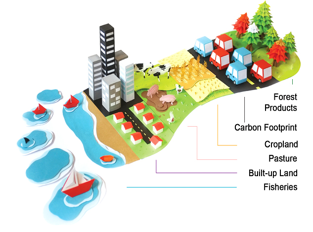
What is the ecological footprint and what does it indicate?
"(... The) Ecological Footprint accounting measures a population’s demand for natural ecosystems’ supply of resources and services.
On the demand side, the Ecological Footprint measures an individual or a population’s demand for plant-based food and fiber products, livestock and fish products, timber and other forest products, space for urban infrastructure, and forest to absorb its carbon dioxide emissions from fossil fuels.
On the supply side, a city, state, or nation’s biocapacity represents its biologically productive land and sea area, including forest lands, grazing lands, cropland, fishing grounds, and built-up land."
The Ecological Footprint indicates whether or not the use more natural resources (Ecological Footprint) is higher than their ecosystems can regenerate (biocapacity). If so, this is called "ecological deficit". The opposite is "ecological reserve".
It can be calculated, for countries, cities and individual people.
What role does this play in my project?Does it have potential? Evaluation
The Ecological footprint can be calculated for companies as well. It is universal and adaptable which is an obvious strength. However, it gives no clear indication of what the main source of ‘overshoot’ of an entity is, nor does it present any policy solutions to the problem. As an indicator it really just tells us if we are sustainable or not in terms of the carrying capacity of the earth.
This is the main aspect of what my label is supposed to show: how sustainable a product is. The missing motivation and encouragement can be covered by an expansion of that label by modern technologies.
16/03/2020: Jonathan Barnbrook
ADBUSTERS - First Things First
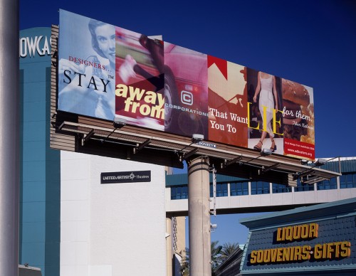
What is this project about?
This poster refers to the first things first manifesto which was signed in 2000. It debates the role of designers in society and discusses meaningful design.
It says, "Stay away from cooperations that want you to lie for them".
How is this related to my project?
This shows the possibilites of scaling up projects. The big billboard draws attention and relates to today´s advertisment industry. It is often over the top and just tries to catch people´s eyes. The used tool for that is design. Is that what design is for?
Design is used for many different fields and purposes which intentions are very various as well. Can it be seperately regarded?
Nevertheless, playing with scale is a very important and simple way to highlight various things. This is something that I can experience with that workshop as well. People´s reactions are very varied when scale is changed.
24/03/2020: Emissions on lockdown
Ghosh, I. (2020). The Emissions Impact of Coronavirus Lockdowns, As Shown by Satellites. [online] Visual Capitalist. Available at: https://www.visualcapitalist.com/coronavirus-lockdowns-emissions/ [Accessed 24 Mar. 2020].
Effects of lockdowns on the environment

What do these graphics show?
These diagrams show that the emissions shrink radically since society stands still due to the lockdown which is due to COVID 19. People have stopped working and travelling (Wuhan and Northern Italy).
However, they quickly rise again after they have returned to their usual everyday lifestyle.
What does that mean? How does that influence my project?
It is very interesting to see the effects of such a big change in our lifestyles because people are forced to act like that. The impacts of COVID 19 are directly recognisable in contrast to climate change. Nevertheless, we should act with the same conviction and strictness even though we do not see the consequences in such a direct way.
However, this shows that we have to take stricter measures, but it also highlights that all of us have to work together to obtain a more sustainable future. It is very sad to see that these effects apparently do not really last long-term.
People need to be informed about these effects especially that the emissions rise above a critical level quite quickly after they have returned to their usual lifestyle. This highlights how each of us have an impact on the environment.
25/03/2020: Teddy Bears
RNZ. (2020). Teddy bears in windows to cheer up kids during lockdown. [online] Available at: https://www.rnz.co.nz/news/national/412602/teddy-bears-in-windows-to-cheer-up-kids-during-lockdown [Accessed 25 Mar. 2020].
Teddy bears in windows to cheer up kids during lockdown
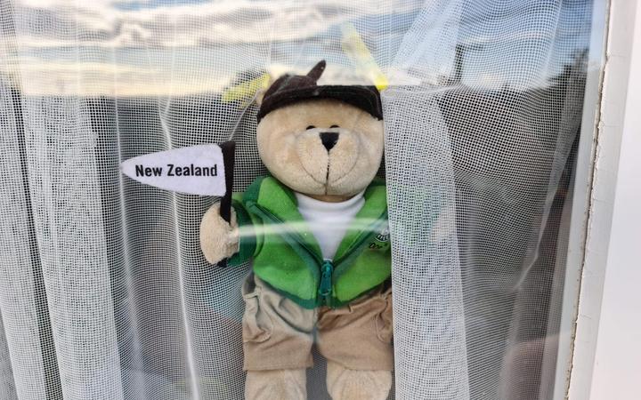
Why do people put teddy bears in their windows?
The bear hunt movement is taking off here, after proving popular overseas.
A Facebook page 'We're Not Scared - NZ Bear Hunt' has been set up to encourage people to place a teddy bear where it can be seen from the street.
Organisers say they have had an overwhelmingly positive response with over 8000 people following the page.
The movement has started small, but the message was spread quite fast and the resonance was very positive. Social media gives the oppurtunity to spread information very fast and internationally.
Does this not encourage people to leave their house?
"We're Not Scared - NZ Bear Hunt is for your local streets, we are not encouraging travel across town to view other streets," they said on the page.
Even though they emphasise that they do not want to motivate people to leave their house just to go for a bear hunt, it cannot be assured that people adhere to that statement. Nevertheless, I think it is very nice to give people some encouragement in these dull and difficult times, especially children really suffer from these circumstances.
What can I learn from this movement?
This movement and how fast it spread highlights that all of us can have an impact on current happenings. It does not only encourage people to join the movement and particpate, but it also motivates people to stand up for their own concerns.
Moreover, this is a good example of how to bring people together so that they work together and support each other. This can be part of my project as well. Informing people should not be one-sided. People should educate each other and exchange their thoughts and ideas.
26/03/2020: clearer air, cleaner water
Video Link:
https://www.youtube.com/watch?time_continue=42&v=HVwjs_D_kRI&feature=emb_logo
In this video, the positive environmental effects of coronavirus are shown. The reduction of transportation and travel which reduces tourism, in general, had an impact on the environmental conditions of these regions or entire countries that are in lockdown.
What does that mean? How can we make use of these new insights?
It shows how overstrained our environment is. Tourism is a very big burden for nature, but it is often accepted since it demonstrates a very big part of the economy.
We have to rethink our lifestyle and how we define us as a human race, a nation or an individual. We cherish our achievements in technology etc which enables us to live the way we do. However, it often gets self-understood and we do not value and appreciate these as we should.
How is this relevant to my project?
People need to be informed about these effects. It is important that people realise how this change of lifestyle has such an impact on the environment. Tourism and population cannot be measured by means of the space. The biocapacity has to be taken into account which highlights the problem which tourism brings with it concerning various natural places.
15/04/2020: metabunk website
Metabunk
weblink:
https://www.metabunk.org/home/
What is this website about? How does it work?
Metabunk is a website that intends to debunk conspirancies. Members of the webpage can post articles with reliable and scientific proofs and can react to other articles.
What differentiates this website from other platforms as twitter? If so, why?
The community on this website is less hateful and the content is way more serious. I think this is because this website is seperate to other platforms like social media networks that are less specialised. Therefore, the methods and research of the member are more extensive, informative and reliable.
The overall approach of this website is way more scientific. It intends to make people question the information which they are bombarded with on a daily basis.
What is positive or negative about that?
It is definetely positive that the content is more reliable and informative. Moreover, it is also positive that the interaction on this platform is based on mutual repsect. In addition to that, the website has a searching feature that enables the visitor to search certain keywords. This allows checking information that one has gathered from other sources.
However, I think that this website does not reach that many people, precisely because it is so specific. The website counts 8,312 (15/03/2020). Sharing links or posting about the individual cases on other more popular platforms might help to get more publicity. People need to be informed about false information that is spread.
How does that inform my project?
Such an informative aspect could be part of my platform as well. This would be a possibility to keep this website/project of mainting the environmental successes
16/04/2020: Gustavo Pedrosa
Gustavo Pedrosa

What is this project about?
This illustration is part of a few of some brainstorming ideas that Gustavo Pedrosa did for Freepik. This one is about house searching.
What is special about this illustration?
The illustration is quite literal, but he has played with scale a lot. This relation of different scales express the power structure. However, it is very positive due to the bright colours and the flowers.
What influence does this have on my project?
I really like the colour scheme. It expresses a sort of freshness and positivity. In addition to that, it can also apply to natural environments such as the sea and sky. So, I want this to find influence in my design as well. Also, the playful side of this illustration is very intriguing since it underlines the aspect of optimism and positivity.
21/04/2020: user study
AUDIENCE
Who is my audience?
This chart shows that a very broad age group can be reached online. However, I speak from personal experience that the skills are on very different levels. It can be noticed that older people struggle more often with modern technology.
Nevertheless, the development shows that a lot more older people access the internet now than 20 or even 10 years ago. Further, it is still rising.
What does that mean for my project?
The online sector is almost maxed out which means that we can now reach the general public online, but it has to be kept in mind that this only applies to modern developed countries.
This issue highlights the inequality worldwide. The access to the internet offers a lot of chances. Speaking of my project, it means that only citizen of progressive countries can contribute to the idea development.
It stresses an absolute inequality of opportunity even if it does not concern final political measures. There is nothing like the internet concerning connecting, but still parting the world at the same time.
28/04/2020: Sustainable Branding
Branding
by Molly Morgan
This is one of the outcomes of one of my fellow class mates for a sustainable branding identity of a new business.
What do I like about it? What does inspire me?
I really like the clarity of the design. She has only used simple shapes. Further, I like the display of this design in various colours. Colours are often the key to form an identity and I think that these are very well-selected.
What can I learn from this?
This has shown me the importance of being very selective referring to colour choices. So, I need to rethink my colour palette to make it more representative.
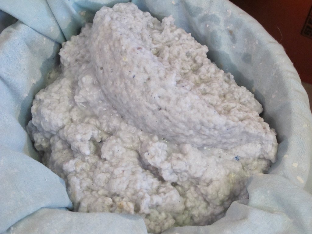
26/02/2020: Fatconomy
FATCONOMY
Robert Johnson

What is Fatconomy?
Fatconomy is a design system for rethinking the value of fat waste produces in commercial kitchens across London.
It illustrates the potential of discarded fats for the economy, material innovation and urban planning.
Why is Fatconomy important for my project? How do they relate?
Fatconomy is guided by a human-centred design methodology and based on the principles of the circular economy. The system encourages us to work together and create an alternative sustainable future.
The core of Fatconomy reflects my aim as well. It is based on values such as community and sustainability.
What does circular economy mean?
Circular economy is a model of production and consumption whereby existing materials are shared, reused, repaired, refurbished and recycled to extend their life cycle for as long as possible.
26/02/2020: Fedrigoni Papers
Fedrigoni Papers. (2020). Homepage | Fedrigoni Papers. [online] Available at: https://www.fedrigoni.co.uk/ [Accessed 26 Feb. 2020].
Fedrigoni Papers

Who is Fedrigoni Papers?
"Since its foundation in 1888, Fedrigoni has specialised in fine paper for printing, editing, labels, bookbinding, packaging and paper products. While this remains very much at the heart of the business, the company continually creates new paper processes and technologies that satisfy the ever-changing aesthetic and technical demands of the market. "
How do I know about Fedrigoni Paper? How does it inspire my idea?
Fedrigoni Papers gave a talk at CSM during the Displays of Data project. It was very interesting to be informed about paper making processes as well as different properties of certain papers. The choice of paper can change the whole perception of a design due to its ability to convey a message. We always associate various values with different materials as brown recycled paper is closely linked to the idea of sustainability.
So, this talk has reinforced my interest in the invention of new processes and technologies. It also shows how important it is to think about details since it can make a project successful or fail completely.
27/02/2020: System Design
System Design
What is system design?
"A design system is a collection of elements that can be combined and reused to build products. (...) A design system is about communication. A well-crafted design system establishes a common shared language among team members, and this language allows the team to collaborate more effectively. "
What does that mean? What is the key to a successful design system?
This definition implies the aspect of forming a community. A system does not only connect several commodities, products and their processes, but it connects the people who work together to complete the system cycle. This highlights the importance of successful communication. To make a system successful and effective a shared language is necessary. This concerns not only "actual" languages such as English, but it also concerns the methodology to convey the core of that system which can be done through signs and colours as well.
What are the motivations to design a system?
- Design debt
- design and technical debt
- non-reusable conventions, inconsistent styles and legacy
- Collaboration and communication problems.
- build bridges between teams and make it easier to reuse work
- Repetitive work.
- frees up time from repetitive work
- thinking more about how the user will use the product
- Consistency within a product family.
- consistent experiences (behaviour and interaction)
What are the key qualities of a well-functioning design system?
- adopted by the team: fits the culture of the team
- balanced: allowes freedom while staying in parameters
- consistent: work well together
- well-documented: always up-to-date
- robust: minimise flaws
- highly reusable: able to be reused in many contexts
- cost-effective
How does this apply to my project aim?
It is really helpful to learn about different strategies and components to design a successful system. Especially thinking about the intentions of a design system - encourage people to work collaboratively to achieve a common aim - helps to focus on the core of systemising.
For my one week project, I want to design a system that encourages people to work together to achieve a more sustainable future. It should connect people that follow the same aim in order to make their impact larger and offer alternative future perspectives.
03/03/2020: Use Less
USELESS (USE LESS) - website
Weblink: useless
My previous research
What is useless?
Useless is a website which informs people about the extent of consumerism and its consequent waste. Further, they inform people about alternative products. They suggest online websites where you can buy certain products. Moreover, you have the possibility to search for zero-waste shops near you.
How is it designed? How does it engage its audience?
The website is designed very interactive. So, it always react to the movements of the computer mouse which makes it very grabbing. One wants to explore the webpage and see how it reacts. Firstly, the viewer is confronted with facts. However, it is not just terrifying, but more importantly motivating because they suggest solutions for these problems as well. People often use single use products because it appears to be very easy. Now, there is no reason for this laziness to think of alternatives anymore due to the simplification of that issue by this playful website.
What do I think about it? How can I apply these techniques/methods?
I also really like the little play of words. It says useless at first and changes to use less when the computer mouse comes through it. It reflects the topic and the website´s approach very well. I can also easily relate to the problematic shown on that website. It was actually my guilty pleasure: It deals with the laziness of really looking for alternative products which is not that difficult, in fact. That is why I really like the concept behind this website which offers a great solution for this problem.
Giving people actual reminders or solutions for an issue is a great idea to change people´s behaviour. In this way they are not just confronted with facts, but have a sort of "guide" to help them actually changing their behaviour. This is why I want to design something that people can take with them after trying out my experience in order to make it even more memorable. It should facilitate the change.
Today´s perspective
How is that linked to my project? What did I learn from my previous research/project and how does it inform my current work?
This website is a very good example for the promotion of sustainability. Promotion is often only associated with profit and advertisement which often relate to companies that meet the requirements of a quickly growing and ever changing economy. Use less presents a different concept or system. Previously, this project has taught me that there are very different approaches to promote something and thus persuade people: stress problems or solve problems.
This website intends to offer alternatives and to help/guide people to life more sustainabily which underlines the concept - "easy to be good". The viewer of this webpage gets concrete guidelines and tips that makes it easy to change their thinking and behaviour without loosing any life quality.
Has my perspective on this work changed?
In contrary, having done more research about costumers decision making process, the main audience that should be addressed and the topic in general has affirmed my thoughts and opinions. The website is easy to navigate and gives fast responds and help.
The only disadvantage is that the process is not immediate. The viewers/customers can inform themselves about products and shops beforehand. However, it involves time and effort which shows that the reach of this website on its own is not that broad since it can only reach an audience that is already consious about purchasing decisions.
04/03/2020: The Mechanics of Human Behaviour
Jedlicka, W. (2009). Packaging sustainability. Hoboken, NJ: John Wiley & Sons.
What is this book about?
This book is about innovate package design. It informs about sustainability and its different approaches and concepts.
"Sustainability Development is development that meets the needs of the present without compromising the ability of future generations to meeet their own needs."
This highlights that sustainability does not mean that you miss out any standards. It just embraces economical and ecological development without restricting one another.
Moreover, this book informs about the mechanics of human behaviour. It stresses what our decisions are based on.
What does influence our purchasing decision?
The processing influences are
- Heart
- Mind
- Perception
- Knowledge
- Attention
- Motivation
- Other People
- Action Barriers
Our decisions are driven by many factors. Often the decisions we make during grocery shopping for example are quite subconsciously or automatically since the environmental influences are quite fast-changing and stressing. People often focus on multiple things while shopping.
The decisions are influenced by factors such as heart (needs), perceiption (how we value packaging in general), knowledge (people want cognitive closure - definite answers), attention( (mindless responding), motivation (value) and what other people do (how sensitive we are to social clues) and action barriers (tone of message).
How does that inform my project?
It is really important to know how people make their purchasing decisions to understand how to make use of these influences. This knowledge can help to develop marketing and branding strategies since it reflects human behaviour. Regarding promotion, understanding your audience and their behaviour is really important in order to reach them and persuade something. The tone of a message is thus very essential as well.
13/03/2020: Branding - Second Choice
Cheung, V., n.d. Less Is More - Limited Colour Graphics In Design.
Second Choice

What do I find intriguing about this design?
Even though a very limited palette of colours is used the design still looks very finished and sophisticated. The concept is represented by the design as well. The pink blocks occur randomly. So, the design is very uniform, but it still has some individuality to it. This shows the oppurtunity of forming your identity and expressing oneself through fashion and style.
How is that related to my project?
It appears to not be closely linked to my project, but in fact the approach of that design is very informative. The limited use of colours gives this brand a clear visual identity. Additionally, it shows how very small changes can already express a lot.
18/03/2020: First Things First
First Things First manifesto 2000
What is that manifsto?
"The question of value-free design has been continually contested in the graphic design community between those who are concerned about the need for values in design and those who believe it should be value-free.[3][4] Those who believe that design can be free from values reject the idea that graphic designers should concern themselves with underlying political questions. Those who are concerned about values believe that designers should be critical and take a stand in their choice of work, for instance by not promoting industries and products perceived to be harmful. Examples of projects that might be classified as unacceptable include many forms of advertising and designs for cigarette manufacturers, arms companies and so on. Adbusters has been a significant outlet for these ideas, especially in its commitment to detournement and culture jamming.[5][6]"
What does this tell me? What can I learn from it?
A manifesto conveys a very clear viewpoint. It unites several core values as well as a clear position which could concern politics, cultures, economics etc. It is very important to really communicate explictily. In addition to that, a manifesto is often a starting point for further debates.

How does the image relate to the content?
A manifesto is rather text based, but the graphics still relate to the context. The type is not very commcercial which underlines the avoidance of using graphic design to advertise. It looks rather artistic. Furthermore, the colour choice is very limited - black and white, This highlights the clear line that the undersigned want to draw.
18/03/2020: Manifesto Design
Personal Manifesto

What do I like/ not like about it and why?
I think that the text seems a bit contradictory. However, the quote communicates the key information very well. It is very important to clearly communicate. It could be a bit more precise.
The colours are well chosen as well as the images. The background colour is quite neutral which stresses the aspect of revoking your own concerns. In addition to that, the plants underline an ever changing environment.
Nonetheless, the word manifesto obviously dominates the page even though it does not communicate that much. I think it is more effective to either choose a suitable headline or to highlight another key word that sums up what message you want to convey.
What can I learn from it?
Looking at that manifesto has taught me how important the choice of words is. Rhetorics play a crucial role in a manifesto. Additionally, finding the right key words and headlines/name for movement, organisation, company or similar.
26/03/2020: Design Interview 10Q
TypeRoom (n.d.). Design Interview 10Q: while in lockdown enjoy a designer’s adventure to be inspired - TypeRoom. [online] www.typeroom.eu. Available at: https://www.typeroom.eu/design-interview-10q-while-in-lockdown-enjoy-a-designers-adventure-to-be-inspired [Accessed 26 Mar. 2020].
Design Interview 10Q
What is Design Interview 10Q all about? What do I (not) like about it?
Sharing inspiring and insightful content with people, making them "feel" part of this global design community of ours which needs support whilst providing interesting insights on each designer's craftsmanship and talent.
We need to stay home, we must fight together against this virus that is generating so many problems so, let's get to know each other better maybe?
I really like the aspect of uniting people and inspiring each other even in such hard times. Designers or people in general can encourage each other and exchange content, thoughts and ideas in this way. It enables people to still work together even if they are isolated.
What potential does it have? How does this influence my project?
During self-isolation and social distancing people shift their social activities online. Many people now look for various oppurtunities to be entertained. Online media are already a big platform for younger people who are also my taget group. The current circumstances just enhance this phenomenon.
Therefore, I am convinced that online games and other entertaining games that can be shifted or shared online have the biggest potential to reach people in times like this.
27/03/2020: Green Finger
www.behance.net. (n.d.). Behance. [online] Available at: https://www.behance.net/gallery/52133991/Green-Finger [Accessed 27 Mar. 2020].
Green Finger by Yu Shin Wang


What is Green Finger?
Green Finger is a fictional company I created that offers products and services related to succulents. It dedicates in offering unique, high-quality products and building a friendly, intimate succulent loving community.
Green Finger has won the 2017 RGD Student Award - Studio123 Award for Visual Web Design.
What is (not) successful?
The website tries to stand out by providing novelty products and services. It involves the customer in the process since they can customise their own products. Further, the products are unique and timely: seasonal. Moreover, they intend to build an intimate community by holding workshops and sharing information.
Putting the customers at the heart of the process is always a good oppurtunity to arouse people´s excitement. Additionally, interactive and responsive websites draw the viewer´s attention.
Besides, the illustration style conveys a very positive atmosphere. It invides the customer to play with this website. The little illustrations are very smooth, cute and playful which is pleasant to look at as well as the colour palette which is very relaxing and well concerted.


How are the sketches translated into the finished illustrations?
The sketches show the basic ideas. It is striking that the finished version is really simplified. Yu Shin Wang really though about what it needs to communicate the message/narrative.
How does looking at this help me? How does this influence my further project development?
Especially the way the website is structured is very helpful. Seeing how to accentuate certain element in a responsive way is very useful and something that I want to make use of in my project as well.
Also, the illustration style has inspired me a lot. The illustrations that I will make for my website should be very calming, but playful as well. So, this has given me an insight into how to create such an atmosphere.
29/03/2020: Asbury & Asbury
#covid19campaign by Nick Asbury
Twitter page:
https://twitter.com/asburyandasbury/status/1241799163941093378
Who is Nick Asbury and what is this campaign about?
Nick Asbury is a poet and copywriter who came up with a few messages that encourage people to stay inside to slow the spread of the corona virus. He has released them through a Creative Commons licence, which means that anyone can use them.
Messages
Home is where the heroes are
Help out. Stay in.
Join the resistance
Keep your distance
Don’t let the virus win. Stay in.
Don't spread it, spread out.
Stay in. Stay in touch. Stay positive.
I'm staying in for the NHS
DON'T PANIC SHOP
How did he approach this issue?
It is very interesting that he has released a Creative Commons licence so that everyone can use these messages. It creates a network between creatives and enables spreading these statements more broadly. Spreading the message about appropriate behaviour during a pandemic is very important. Therefore, it is essential that as many people as possible take part in that project.
What about this project do I find influential?
First of all, the idea of connecting people plays a very crucial role in my project. I want to spread positivity and encourage people to keep up. Furthermore, a few of these statements could be used for my project as well. They are not only related to the virus itself, but can be linked to the positive environmental effects that we notice at the moment.
I want people to take part in that project too. So, my website will involve a layer which allows people to submit their own positive stories and news.
17/04/2020: Binge Please
Binge Please Netflix
Website teaser:
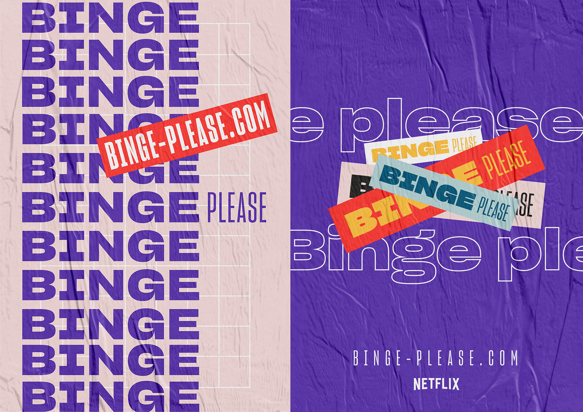
What is this about? What does intrigue me?
BingePlease is an interactive web game. It consists of a serial of 10 visual enigma each illustrating a Netflix TV shows to which the user must find the names of the series, as quick as possible. After obtaining the final score, they suggest to the user to discover the binger profile and TV Shows recommendations based on the answers.
The website is interactive and fast moving. It really responds to the actions the users do. Besides, the colours are very bright which communicates positivity as well.
What can I learn from this?
Personally, I think that it is very successful how the website encourages people to interact with it. However, it is fast changing and moving which can be irritating. So, I really need to find a balance between moving and static elements. It has to be clear, but still innovative and intriguing.
24/04/2020: Glimpse collective
The Glimpse Collective
What is the glimpse collective? What do they stand for?
"Instead of criticising what’s going wrong, we wanted to imagine a world where these problems had been elegantly solved. Many of us are from creative backgrounds and we wondered if we could use our existing skills to show a glimpse of something else, something better."
The glimpse collective is a creative collective with now over 1600 members. They design for better.
#CatsNotAds

What is this campaign about?
The challenge was to claw back public spaces.
London has one of the highest levels of outdoor advertising in the world. The average person sees up to 5,000 ads every single day.
Our public spaces belong to us. But sometimes it doesn't feel that way.
Was it successful?
The campaign was very successful because it got a lot of publicity. It appeared on CNN, Japanese TV, and even feature in a school textbook about consumerism.
However, they cared more about the community's thoughts
.
More importantly, we created a moment of joy and curiosity for commuters and visitors alike.
Thousands came to the station to see the cats, and strangers talked to each other to explain the concept.
One visitor said: "You've done something good in a world that truly needs it right now."
How does this influence my project?
I really like the idea of a creative collective. It is very interesting to have such a big group of people with very different backgrounds. They work together to make a difference and cause positive change. This is something that I would like to include in my project as well. I want my website to encourage people to work together for a better future.
01/05/2020: Fresh start
Will the end of the pandemic bring about a new surge of entrepreneurs?
weblink to the creative review article:
What is this article about? What makes it different from others?
This article provides a new perspective on the coronavirus and its measures. It offers a more optimistic view on the current happenings. The lockdown may have positive results in a long run since people now have time to focus on new skills and hobbies. This enables people to learn a new skillset and to open up new personal as well as professional possibilities.
How does this information affect my project?
This reinforces my decision to change my concept a bit. It provides a positive viewpoint on the coronavirus as well. It can be seen as a fresh start which is the base for the idea development of my website users.